Inside Real Estate Branding
Every so often you get handed a design problem that sounds simple in theory and turns out to be anything but. This one looked like a logo update on paper. In practice, it was a brand architecture question: how do you infuse the energy of a breakout product — BoldTrail — back into the parent brand it came from, without losing what Inside Real Estate had already built?
This is how our internal Brand Team resolved this design problem, and created a lasting legacy.
-
Design Director, Art Director, Brand Systems Engineer
-
Brand Identity / Web Design / Product Marketing
-
Project management, including stakeholder alignment, monthly meeting coordination, and task assignment.
UX Research
A/B and Split URL Testing
SEO/AEO/AIO research and implementation
-
Erinn Farley | VP, Creative Director
Marla Tipton | Design Director
Keith Hille | Senior Designer (Contractor)
Joanna Bjur | Sr. Manager of Content & Comms
Lee Bressan | Comms & Content Strategy
Jacob Vig | Full Stack Developer

The Outdated Logo.
Inside Real Estate's old logo was a house icon in lime green — friendly enough, but it wasn't doing the brand any favors. It read more like a generic tech startup mark than a company with real staying power in the real estate space. And it wasn't just a vibe problem: that green, paired with an "in"-forward treatment, had drifted close enough to other marks that it occasionally caused actual double-takes.
Creating a Branded House
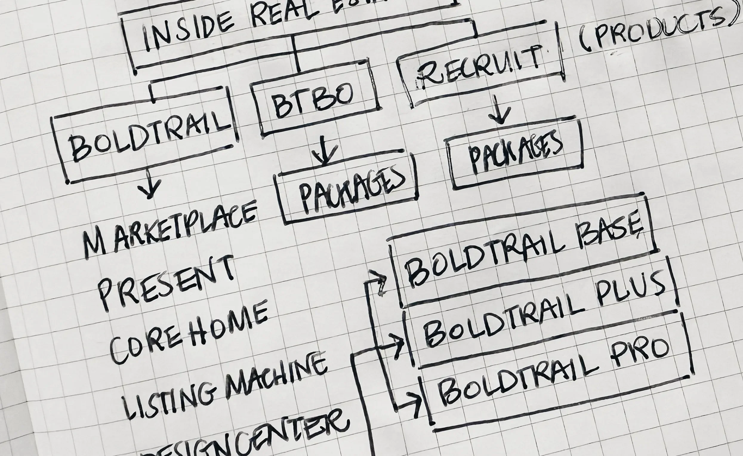
Inside Real Estate isn't just a parent brand floating above everything — it's the house for a portfolio of products, and BoldTrail is the flagship. BoldTrail's brand already had a distinctive arrow motif built into its mark, one that had done real work establishing BoldTrail's own identity in the product suite.
Now it was finally time to think of our original goal—a branded house where our portfolio and parent marks felt like they belonged together. After creating our brand architecture diagram, we were left with the question:
“What binds all of these different products together?”

Borrowing From the Family
Instead of treating the parent brand and the product brand as two separate design exercises, I pulled the arrow from BoldTrail up into the Inside Real Estate mark. It's a small move with an outsized payoff: now the parent logo visually tells you it's connected to the product ecosystem underneath it, instead of just living next to it on a slide with no shared visual language. It's the difference between "these are two logos that happen to be related" and "you can see these are related just by looking at them."
The payoff? The parent and the product look like they're speaking the same visual dialect, not like they got merged in an acquisition and never properly introduced.
Reflection